Back to Top

  • WELCOME TO ARTBYKALINKA

    Where art comes from the heart


  • WELCOME TO ARTBYKALINKA

    Where art comes from the heart


  • WELCOME TO ARTBYKALINKA

    Where art comes from the heart

Proportions in drawing

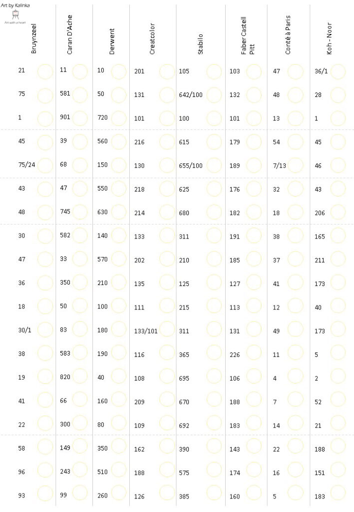
Finding the right proportions in portraits can be tricky. In this post you’ll find a few techniques that can help you draw your portraits using the right proportions, based on the golden ratio.


Many artists use carbon paper or light pads to trace the original photo and then color it, paint it or finish it using graphite pencils.

Even though it helps with the correct placement, I really advice every artist to not trace their reference photo’s, since it will not teach you to really draw yourself.


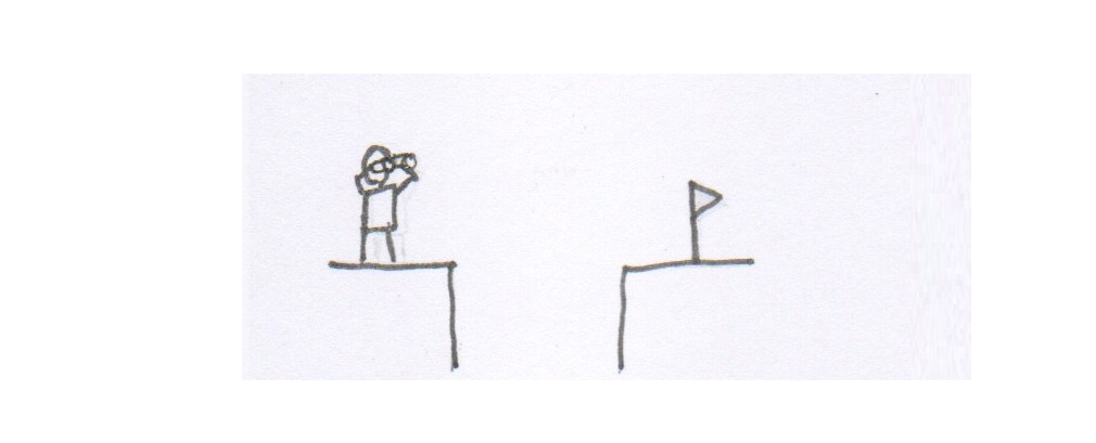
The techniques below help you to really look close to your subject when drawing and it enhances your skill to freehand draw.

The last technique (circle technique) furthermore helps you to draw even without a reference. 

Just try out these techniques and see what they can do for you.


And remember: even when a drawing ‘fails’ it’s a door to success. Use your …

Continue Reading

Tips for starting artists (and the advanced artists that want tips)

Having been part of several art groups in Facebook, I’ve come to realize that most beginning artists don’t know what they want to achieve in their artwork, let alone where to start and how to get there. Most are tempted to start joining courses and end up paying for expensive yet generic lessons that do not comply with the actual and individual goals.


This post is about helping you to get “the focus you need to make the progression you want”. 

And if you get stuck, feel free to join my artgroup on Facebook , where we aim to help all of you reach your art goals. No paid lessons, just simply the help that fits your level and goals.


Know what you want to achieve

The moment you decide you want to draw, you’ve already seen many drawings. And some of them made you think “I want to be …

Continue Reading

Skin tone practice stencils colored pencils

Below are the blank stencils with the same brand color numbers as  shown in the tutorials. Click on the image to enlarge, rightclick on the enlarged image to save. When printing I advise you to print on thicker printing paper with a slight grain or to draw the actual exercises on pastelmat and then cut those out and stick those on the printed paper

Light skin tones stencil
Medium skin tones stencil
Dark skin tones stencil
Comparing brands swatch stencil

Skin tone practice stencils pastel pencils

Below are the blank stencils with the same brand color numbers as  shown in the tutorials. Click on the image to enlarge, rightclick on the enlarged image to save. When printing I advise you to print on thicker printing paper with a slight grain or to draw the actual exercises on pastelmat and then cut those out and stick those on the printed paper

Light skin tones stencil
Medium skin tones stencil
Dark skin tones stencil
Comparing brands swatch stencil

Skin tone with colored pencils

Do you struggle with achieving skin tones? Without pretending I know it all, I wanted to share my technique for creating realistic skin tone using pastel pencils. Below you find 3 variations on light, medium and dark skin each. These variations are based upon cold, neutral or warm tones of the skin and the colors I use to achieve that. I’ve created these examples using various brands and I give the color numbers and/or names of these colors for you to reproduce these skin tones. I realise these photo’s aren’t of the best quality, as soon as I’m able to, I will remake these examples and replace the images

How to interpret these examples

Below you find the warm, neutral and cool variations on the 3 skin tone groups Light, Medium, Dark.

Every example is made with colors from a certain brand and on the right of every example you …

Continue Reading

Skin tone with pastel pencils

Many artists struggle with achieving skin tones. Without pretending I know it all, I wanted to share my technique for creating realistic skin tone using pastel pencils. Below you find 3 variations on light, medium and dark skin each. These variations are based upon cold, neutral or warm tones of the skin and the colors I use to achieve that. I’ve created these examples using various brands and I give the color numbers and/or names of these colors for you to reproduce these skin tones. 

How to interpret the examples

Below you find the warm, neutral and cool variations on the 3 skin tone groups Light, Medium, Dark.

Every example is made with colors from a certain brand and on the right of every example you find the used colors of that brand. 

The order in which I give the colors, is also the order in which I’ve created the …

Continue Reading

Pastel pencil swatching

It can be a drag, trying to find the right colors for your artwork. The color of the pencil itself may not represent the color once it’s put to paper. To help yourself to the right color selection, you may consider swatching your pencils.

Swatching means you use a stencil that contains the color names and numbers, and the actual color as it appears on paper. Obviously, you’re the one doing the actual coloring thing, but many websites offer printable stencils. Most of them offer those stencils for sale. You pay a small amount and then you get to download the stencil.

Well, I don’t. 

Below you find the swatch stencils of most professional brands to download for free (simp[y click on the image to enlarge and then rightclick to download. And if your brand isn’t among these, simply download the blank stencil and fill in the names and numbers …

Continue Reading

Colored pencil swatching

In addition to the pastel pencil swatch stencils in a previous post, I decided to create swatch stencils for colored pencil brands as well. Feel free to download them as you please. They are free to use, but please do not spread or alter them since I put a lot of time and effort in creating these. Simply rightclick on the image to save it to your computer. Need to swatch another brand? Download the blank swatch stencil and make your own stencil by adding the brand colors and color numbers

Bruynzeel Design
Caran D'Ache Luminance
Derwent Chromaflow
Derwent Coloursoft
Derwent Lightfast
Derwent ProColour
Faber Castell Polychromos
Prismacolor Premier
Blank Swatch

Help, where to start with colored pencils

Beginning with a new art medium can sometimes be overwhelming. So many brands, so many flavors.

In this section I’ll tell a thing or two about the products I use (or used to use)and what their advantages and disadvantages are (in my opinion at least).

Mind, I can only talk about my own experiences with these products, your experience can be totally different because your style may be different, or somehow materials that work for me, don’t work for you or vice versa.

Just know that I’m not affiliated to any brand at all and these are just my findings, for what they’re worth to you

General

Colored pencils come in different brands, types and colors. And then there is the way the pencils bind the pigment. Some are oil based, others are wax based.


What is the difference between wax based and oil based?

For starters, wax based …

Continue Reading

Yeah…but how did you….?

I’ve been asked on many occassions to record my drawing process so people could see how I create my drawings. Not that I’m such a good artist but somehow some people like my drawings and want to know if they can learn a thing or two from the techniques I use.

I tried to make a video recording of me drawing on various occasions and on almost all of those occasions, I missed an entire part of the process because I had to record in several sessions and forgot some important part somewhere in the middle of the creative process.

Besides that, I never had the equipment to record myself drawing anything from a good angle.

Until recently, when I bought a cellphone mount to record videos from above my desk.

This drawing is the first one I did, recording each part of the drawing process of a graphite portrait …

Continue Reading